Hierarchy - UI improvement
This time light topic of UI designing :] But before this let's discuss how the hierarchy in the engine works. So it was easier to understand these, let's look at the tooling of it:
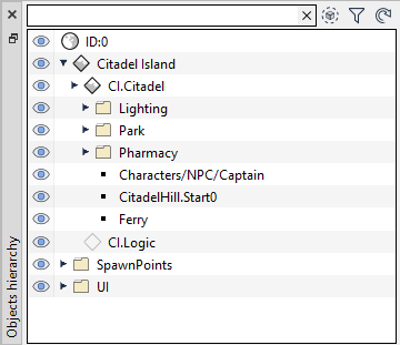
We have there:
- World (ID:0)
- Loaded Stream (Citadel Island)
- Loaded SubStream (CI.Citadel)
- Unloaded SubStream (CI.Logic)
- Folders (f.ex. Park)
- Entities (f.ex. Ferry)
If you are curious what a Stream is, you can think about it as a scene or a level.
Now that we know all of this let's look a little bit closer at what we have. Streams and SubStreams are exactly the same I change the name based on their position in the hierarchy. The Folders may look different than Entities but they are exactly the same. They are Entities with a folder component. If we go this way streams are also just Entities with a Stream Component. This leaves us with a bunch of the entities under the World. Which as you can suspect is just an Entity with ID equal to 0.
If everything is an entity, what was the reason I came with all these weird names? The answer is simplicity. People have a hard time thinking about abstract concepts, by introducing Folders, Entities, Streams it becoming a lot easier for most people to understand what happens. As you can notice I did not stop on using naming, I also introduced different icons:
- World:

- Stream:
 /
/
- Folder:

- Entity:

There is also a standard black arrow showing if the entry has some children. All of that was done to make clear what is what and how hierarchy looks. There are also special cases like a stream, where I introduced two icons so users intuitively know about its state:
Today I realized that this was not good enough. Stream has four different states and not only two. So far I have had this kind of iconography:
Unloaded⟷ Loaded
⟷ LoadedThe issue is that transition between these two states is not instantaneous. There is some, Δt > 1 sec that is involved there. This makes transitions to another state a state itself. We need to think about that this way because otherwise there is confusion :
Unloaded→ Streaming In → Loaded
→ Streaming In → LoadedLoaded→ Streaming Out → Unloaded
→ Streaming Out → UnloadedI could probably change it into:
Unloaded→ Streaming In → Loaded
→ Streaming In → LoadedLoaded→ Streaming Out → Unloaded
→ Streaming Out → UnloadedThis would make some people happy but in the end, it does not solve the underlying issue: We informing that stream is loaded/unloaded when it is not. For a lot probably not a big issue but if you know about it, it is pretty annoying. In the end, the solution is pretty trivial:
Unloaded→ Streaming In → Loaded
→ Streaming In → LoadedLoaded→ Streaming Out → Unloaded
→ Streaming Out → Unloaded Two new icons make a big difference. The whole thing took just a few minutes because I already had icons for these operations laying around (I use them in the context menu). This of course not include the time that it took me to realize there was a problem in the first place. Then I would need to put there more than two years.

Hiya, is the LBA remake still being developed?
ReplyDeleteYes it still is
Delete